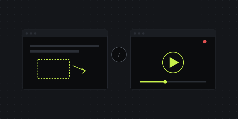
A screenshot wins when the explanation fits in one frame
If the problem or instruction is static — "it's this button," "there's a typo here," "change the color of this element" — an annotated screenshot explains it instantly and asks nothing of the client but a glance. No video to play, no moment to scrub to, nothing to relisten to — it's all on one screen.
A screenshot also wins on speed to create: capture the area, circle or label the problem spot, send the link. The whole cycle takes under a minute.
A recording wins when there's a sequence of steps
The moment an explanation includes the word "then" — "click here, then open this menu, then fill in this field" — text and a static image start to lose. The client can skip a step, mix up the order, or fail to find an element that looks different on the screenshot than it does on their own screen at the moment they need it.
A screen recording with narration shows the actual movement: where the cursor goes, what appears after a click, how long each step takes. That matters especially for non-technical clients, for whom "go into the API settings" sounds like a foreign language, but watching exactly where to click needs no explanation at all.
A simple system to decide in 3 seconds
Ask yourself two questions, in order:
- Does the explanation fit in one frame? If yes — screenshot. One action, one issue, one glance.
- Does it need to show a sequence or movement? If yes — recording. Multiple steps, animation, cursor movement — anything that can't be "frozen" into a single image without losing meaning.
If the answer to both is "no, or not sure" — go with the screenshot. It's always the faster, cheaper option in terms of the client's attention, and nine times out of ten it's enough.
The hybrid option: when you need both
Sometimes the best answer isn't either/or. A screen recording shows the whole process, and a screenshot attached afterward with the final state circled locks in "this is what the result should look like" — the client doesn't need to scrub the video back to double-check themselves.
What the client sees on their end
Format is only half the equation. The other half is how easily the client can open what you sent. If viewing requires a sign-up, an app install, or hunting for a file buried in an email attachment, even a perfectly chosen format loses part of its effect.
That's why viewing a screenshot or a screen recording in DashShot is just opening a link for the client: no sign-up, no app, with comments right under the recording or screenshot. And the screenshot editor — arrows, text, pixelation, cropping — turns "just a screenshot" into a clear explanation in a few seconds, with no separate image editor to open.