Why a marked-up screenshot beats a written explanation
"It's the button in the top-right corner, next to the icon that looks like a gear, above the search bar" takes longer to read than it takes to look at an arrow. Every extra clause in a text description is a chance for the reader to picture the wrong element, especially once the interface has more than a handful of buttons on screen. An annotated screenshot collapses all of that into a single glance — no re-reading, no "wait, which one."
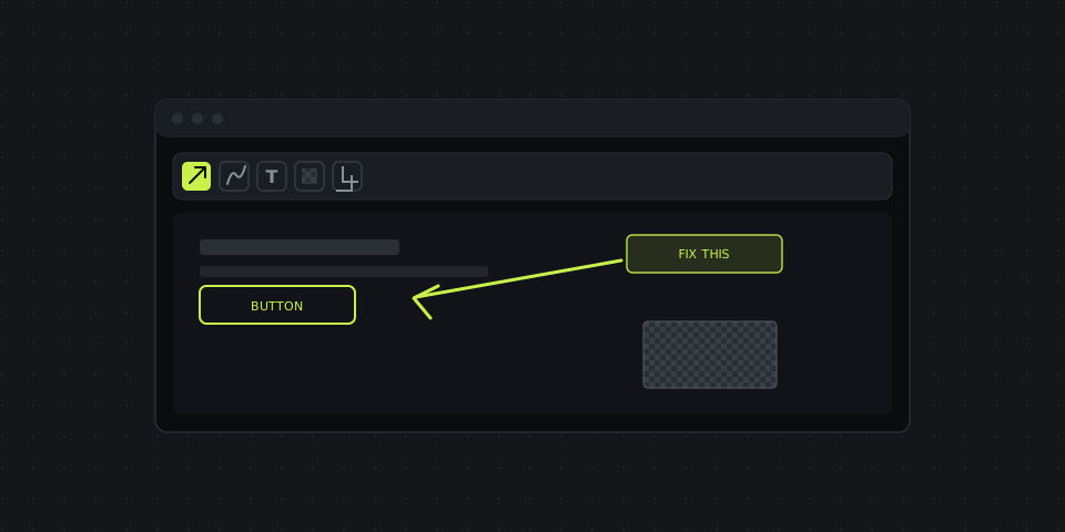
The five tools below cover almost every situation: arrows for pointing, freehand for anything that isn't a single point, text for the one line of context an arrow can't carry, blur for anything that shouldn't be visible, and cropping to cut the parts of the screen that aren't relevant. Used together in the right order, they turn a raw capture into something that explains itself.
Arrows — point at the thing, skip the paragraph
An arrow does the job of a sentence like "see the button in the top-right corner, next to the settings icon" in about half a second. It's the single most useful annotation on a screenshot because it removes all ambiguity about what you're talking about — there's no "which one do you mean?" follow-up message, and no back-and-forth to clarify.
The one rule that actually matters: start the arrow in empty space and end it right at the element, not on top of it. An arrow that overlaps the button it's pointing at just adds visual noise to the exact spot you want someone to look at — the whole point of the arrow is to get out of the way once it's done its job of directing attention.
A second, smaller rule: keep the arrow short. A long diagonal line across the whole screenshot reads as decoration rather than direction. If the thing you're pointing at is far from any obvious open space, crop the screenshot first so the arrow doesn't have to travel as far.
Freehand drawing — for anything an arrow can't circle
Some things aren't a single point — a row in a table, a block of text with a typo, an entire section that's misaligned, a group of checkboxes that should be unchecked. That's what freehand drawing is for: circle the area, underline a line of text, or sketch a rough box around a cluster of elements.
It's deliberately less precise than a rectangle tool — a slightly wobbly circle drawn by hand still reads instantly as "look here," and it's faster to draw than lining up a perfectly straight-edged shape around an irregular area. Precision matters for the crop tool, where you're cutting the actual image; it matters much less for a freehand mark, where the only job is to draw the eye.
Text labels — when the image alone won't explain it
An arrow says "here." A text label says why. Use it for the one-line context an arrow can't carry: "this needs to be red," "typo," "broken on mobile," "change this copy." A label with a solid background behind the text — rather than plain text floating directly on the image — is worth using by default. It stays legible over busy backgrounds, dark UI, and photos, where plain text in a similar color to what's behind it can effectively disappear.
Keep it to one line where you can. A text label crowded with three sentences stops being an annotation and starts being a paragraph someone has to read before they even look at the screenshot underneath it — at that point you've reintroduced the exact problem the screenshot was supposed to solve.
Blur and pixelation — hide sensitive data before you send it
Anything with an email address, an account number, a customer name, or an API key visible in a screenshot needs to be covered before that image leaves your machine — not after, and not with a quick black rectangle drawn on top. A solid-color box can be a false sense of security in some editors: it sits on its own layer above the image, and depending on the tool, it can be nudged aside, made semi-transparent by a recipient's own screenshot tool, or simply deleted — revealing the original pixels underneath, unchanged.
Pixelation actually destroys the underlying detail instead of just covering it, which is the difference that matters here. Drag over the region you want hidden — a password field, a line in a support ticket, a customer's face, an order number — and the pixels themselves are scrambled into an average of their surrounding colors. There's no original data left underneath to recover, because the recoverable version simply doesn't exist anymore once it's been pixelated and the image re-saved.
Get in the habit of checking for this before every screenshot you send outward, not just the ones that obviously contain something sensitive. The screenshots most likely to leak data are the fast, unremarkable ones — a quick capture of a dashboard sent in a support chat, where nobody stopped to look for a stray email address in the corner.
Cropping — cut everything that isn't the point
A full-screen capture usually has a browser toolbar, a dock, a dozen open tabs, and a bookmarks bar competing for attention with the one thing you actually wanted to show. Cropping removes all of it. Drag the corner handles in to the exact area that matters — the smaller and more focused the final image, the less time the viewer spends hunting for what you meant, and the less of your screen ends up visible to someone it wasn't meant for.
Crop after annotating, not before, if you're planning to both mark something up and trim the frame. Cropping first can cut off the empty space an arrow needs to start in, or push a text label off the edge of the new, smaller canvas — leaving you re-adding the annotation you already placed.
Keyboard shortcuts that skip the menus
Once you're taking more than a couple of screenshots a day, the shortcuts save more time than any single editing tool does on its own — the difference between a capture-to-link workflow that takes five seconds and one that takes five clicks through menus first. DashShot's defaults, customizable from the tray icon's settings menu:
- Ctrl/⌘ + Shift + 1 — drag out a region (draggable corners, movable after you release) → opens straight into the editor with arrows and text ready to use.
- Ctrl/⌘ + Shift + 2 — instant full-screen capture, no region to select, straight to a shareable link.
- Ctrl/⌘ + Enter (inside the editor) — generate the link once you're done annotating.
- Ctrl/⌘ + C — copy the finished PNG straight to your clipboard, no file to save first.
- Ctrl/⌘ + S — save the edited image to disk.
- Ctrl + Z — undo the last annotation, same as any editor.
The two capture shortcuts alone cover most real situations: one for "I need to point at something specific," one for "just capture what's on screen right now, exactly as it looks." Learning just those two removes the need to open the app, find the capture button, and click it every single time.
Common mistakes worth avoiding
- Too many annotations on one screenshot. Three arrows, two circles, and a text label all on the same image forces the viewer to figure out the order to read them in, which defeats the purpose of an annotation being instantly clear. If you're marking up more than two or three things, that's usually a sign you need two screenshots instead of one busy one.
- Inconsistent colors. Red for "look here," a slightly different red for "this is wrong," and a third shade for emphasis makes a document feel unplanned even when the content is fine. Pick one color for arrows and text and stay with it across a whole explanation, ticket, or document. Reusing the same swatch in DashShot's editor keeps this automatic rather than something you have to consciously remember each time.
- Skipping the blur step under time pressure. The screenshots most likely to leak sensitive data are the fast ones — a quick capture sent in chat without a second look before hitting send. Building a habit of scanning for anything identifiable, every single time rather than only when it's obviously sensitive, is the only reliable fix.
- Arrows that overlap what they're pointing at. Covered above, but worth repeating because it's the single most common annotation mistake: an arrowhead sitting directly on top of a small button or checkbox can make it harder, not easier, to tell exactly what's being pointed at.
A full example: annotate, blur, and crop in one pass
A typical edit takes four steps in order: crop to the relevant area first if there's a lot of dead space around the thing you're explaining, draw an arrow at the specific element, add a one-line text label if the arrow alone doesn't explain why it matters, then blur anything identifiable before copying the link. In DashShot's editor, all four tools live in the same toolbar — no exporting to a second app partway through, which is usually the exact moment a "quick screenshot" turns into a five-minute detour between three different programs.
Once the edit is done, the link is ready immediately — no separate upload step, and whoever you send it to opens it without creating an account. If what you're explaining involves more than a still image — a sequence of clicks, not just one spot to look at — screen recording picks up where annotation stops being enough.